
- Title
-
GATA2 heterozygosity causes an epigenetic feedback mechanism resulting in myeloid and erythroid dysplasia
- Authors
- Gioacchino, E., Zhang, W., Koyunlar, C., Zink, J., de Looper, H., Gussinklo, K.J., Hoogenboezem, R., Bosch, D., Bindels, E., Touw, I.P., de Pater, E.
- Source
- Full text @ Br. J. Haematol.

Gata2b+/− kidney marrow (KM) shows erythroid and myeloid dysplasia. (A) Representative pictures of KM smears after May–Grünwald–Giemsa staining of wild-type (WT) KM smears (panels 1 and 2) and gata2b+/− KM smears (panels 3–8). (3) Blebbing in the cytoplasm of proerythroblast; (4) irregular cytoplasm in erythroid precursor; (5) lobed nucleus and micronucleus in erythroblast; (6) blebbing in the cytoplasm of the blast of sorted cell after cytospin; (7) binucleated promyelocyte; and (8) multinucleated promyelocyte. (B) Frequency of dysplastic cells of the erythroid, myeloid and lymphoid lineage in KM smears of WT (n = 8) and gata2b+/− (n = 8) zebrafish. ***p < 0.001. |
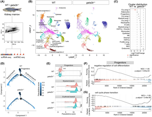
Single-cell transcriptome analysis reveals a differentiation delay in gata2b+/− HSPCs. (A) The flow cytometry-based sorting strategy for kidney marrow (KM) cells for single-cell RNA-sequencing (scRNA-seq) and single-nucleus ATAC-sequencing (snATAC-seq) analyses. (B) Uniform manifold approximation and projection (UMAP) analysis of scRNA-seq showing all 19 cell types. UMAP atlas was separated between wild-type (WT) and gata2b+/− cells. (C) Cluster distribution quantification of cell types in scRNA-seq between WT and gata2b+/− KM, with significantly differentially distributed clusters represented in pink. A statistical significance threshold of the false discovery rate <0.05 and absolute log2 fold change >1 were applied to determine the significance of the observed differences. (D) Pseudotime trajectories showing the developmental track of all progenitor cells involved in WT and gata2b+/− KM respectively. Arrows indicate the developmental direction. Dots represent cells labelled by pseudotime scores. Dark blue indicates lower pseudotime scores and light blue indicates higher pseudotime scores. (E) Ridge chart showing the cell distribution along the pseudotime trajectory. Ridge curves indicate the cell density after ordering by pseudotime score. Box charts show the statistical pseudotime score analysis of cells involved in each branch; t test was used to calculate p value. Black arrows indicate the pseusotime score of the highest peak point WT and gata2b+/− ‘progenitors’. ns, not significant; ***p < 0.001. (F, G) Gene set enrichment analysis (GSEA) of cells in ‘Progenitors’ clusters. (F) GSEA representing negative regulation of cell differentiation is up-regulated in the gata2b+/− ‘Progenitors’, and (G) GSEA representing cell cycle phase transition was down-regulated in the gata2b+/− ‘Progenitors’. NES, normalized enrichment score; p.adjuts, adjusted p value. |

Differences in chromatin accessibility of Gata2b result in up-regulation of Gata2b expression in gata2b+/− HSPCs. (A) Uniform manifold approximation and projection (UMAP) analysis of single-nucleus ATAC sequencing (snATAC-seq) showing all 15 cell types. UMAP atlas was separated between wild-type (WT) and gata2b+/− cells. (B) Coverage plots showing significant differences in gata2b chromatin accessibility between WT and gata2b+/− HSPCs with the location of the gata2b gene block shown in blue. The normalized peak signal range is 0–40. Highlighted genomic regions within grey blocks indicate the location of two putative enhancers, enhancer 1 (E1) and enhancer 2 (E2). The links between the blocks illustrate predicted cis-regulatory interactions between the gata2b gene body and its upstream region, based on the examination of genome co-accessibility. Link colours correspond to predicted co-accessibility scores, with yellow indicating stronger predicted interactions. Black arrows indicated the co-accessibility between E2 and E1. Red arrows indicated the co-accessibility between E1 and transcription start site. which is stronger in gata2b+/− kidney marrow (KM). (C) Accessibility tracks of the same region shown in (B) in bulk ATAC-sequencing data. The peak signal range is 0–750. Blue blocks show the gata2b gene and red blocks show the putative enhancers as highlighted in (B). (D) Violin plot displaying the quantification and statistics of gata2b mRNA level in HSPCs between WT and gata2b+/− in 12 months postfertilization (mpf) scRNA-seq. The average log2 fold change of WT versus gata2b+/− is −0.34; t test was used to calculate p value. (E) The dot plot displays the log2 fold-change values of differentially activated transcription factor (TF) motifs in ‘HSPCs’ cluster between WT and gata2b+/− KM. The TF motifs are ranked in increasing order based on log2 fold-change values. Dotted lines indicate the threshold for significance, with absolute log2 fold-change values ≥0.1, the default parameter in function FindMarkers. The blue and red colours represent TF motifs that are statistically significant (p value <0.05) with absolute log2 fold-change values ≥0.1. (F) Representative figure of identification of CD41:GFPint population (in green) and its distribution in the forward (FSC-A) and side-scatter (SSC-A) KM population. (G) Quantification of the percentage of CD41:GFPint cells in WT (n = 12) and gata2b+/− (n = 12) KM single live cells. (H) Representative flow cytometry plots of cell cycle analysis by anti-Ki67 and DAPI staining in WT and gata2b+/− CD41:GFPint KM. (I) Quantification of the percentages of WT (n = 3) and gata2b+/− (n = 3) CD41:GFPint cells in different cell cycle stages. Data represent mean ± standard error of the mean. t Test was used to calculate p value. *p < 0.05; **p < 0.01. |
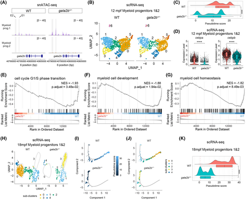
Heterozygous gata2b results in myeloid differentiation delay. (A) Coverage plots showing the gata2b chromatin accessibility between wild-type (WT) and gata2b+/− ‘myeloid progenitors 1’ and ‘myeloid progenitors 2’ with the location of the gata2b gene block shown in blue. The normalized peak signal range is 0–40. Highlighted genomic regions within grey blocks indicate the location of two putative enhancers, enhancer 1 (E1) and enhancer 2 (E2). (B) Uniform manifold approximation and projection (UMAP) analysis of ‘myeloid progenitors 1’ and ‘myeloid progenitors 2’ showing the subclusters distribution in 12 months postfertilization (mpf) scRNA-seq. UMAP atlas was separated between WT and gata2b+/− cells. (C) Ridge chart showing the distribution of myeloid progenitor cells along the pseudotime trajectory as shown in Figure S7B. Ridge curves indicate the cell density after ordering by pseudotime score. Box chart shows the statistical pseudotime score analysis between WT and gata2b+/− myeloid progenitor cells, and t test was used to calculate p value. (D) Violin plot displaying the quantification and statistics of cebpa and cebpb mRNA levels in myeloid progenitor cells between WT and gata2b+/− in 12 mpf scRNA-seq. t Test was used to calculate p value. (E–G) Several down-regulated pathways in 12mpf gata2b+/− myeloid progenitor cells in scRNA-seq. NES, normalized enrichment score. (H) UMAP analysis of ‘myeloid progenitors 1’ and ‘myeloid progenitors 2’ showing the subclusters distribution in 18 mpf scRNA-seq. UMAP atlas was separated between WT and gata2b+/− cells. (I, J) Pseudotime trajectory of myeloid progenitor cells in 18 mpf scRNA-seq. (I) Shows the cells labelled by pseudotime scores, separating between WT and gata2b+/− cells. (J) Shows the cells labelled by subclusters as shown in (H). (K) Ridge chart showing the distribution of myeloid progenitor cells along with pseudotime trajectory, separating between WT and gata2b+/− cells. Ridge curves indicate the cell density after ordering by pseudotime score. Box chart showing the statistical pseudotime score analysis between WT and gata2b+/− myeloid progenitor cells, and t test was used to calculate p value. ***p < 0.001; ****p < 0.0001. |
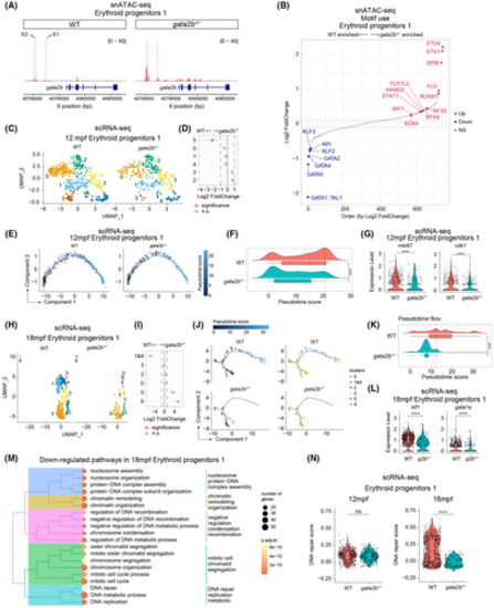
Gata2b+/− result in the impaired erythroid differentiation. (A) Coverage plots showing the gata2b chromatin accessibility in ‘erythroid progenitors 1’ cluster comparing wild type (WT) and gata2b+/−. The location of the gata2b gene block is shown in blue. The normalized peak signal range is 0–40. Highlighted genomic regions within grey blocks indicate the location of two putative enhancers, enhancer 1 (E1) and enhancer 2 (E2). (B) The dot plot displays the log2 fold-change values of differentially activated TF motifs in ‘erythroid progenitors 1’ cluster between WT and gata2b+/− kidney marrow (KM) in snATAC-seq. The transcription factor (TF) motifs are ranked in increasing order based on log2 fold-change values. Dotted lines indicate the threshold for significance, with absolute log2 fold-change values ≥0.1, the default parameter in function FindMarkers. The blue and red colours represent TF motifs that are statistically significant (p value <0.05) with absolute log2 fold-change values ≥0.1. (C) Uniform manifold approximation and projection (UMAP) analysis showing the subclusters of ‘erythroid progenitors 1’ cluster in 12 months postfertilization (mpf) scRNA-seq. UMAP atlas was separated between WT and gata2b+/− cells. (D) Cluster distribution quantification of ‘erythroid progenitors 1’ cluster in 12 mpf scRNA-seq between WT and gata2b+/− KM, with significantly differentially distributed clusters represented in pink. A statistical significance threshold of the false discovery rate <0.05 and absolute log2 fold change >1 were applied to determine the significance of the observed differences. (E) Pseudotime trajectory of ‘erythroid progenitors 1’ cluster in 12 mpf scRNA-seq, separated between WT and gata2b+/− cells. Dots indicating cells labelled by pseudotime scores. (F) Ridge chart showing the ‘erythroid progenitors 1’ cell distribution along with pseudotime trajectory in 12 mpf scRNA-seq, separated between WT and gata2b+/− cells. Ridge curves indicate the cell density after ordering by pseudotime score. Box chart showing the statistical pseudotime score analysis between WT and gata2b+/− ‘erythroid progenitors 1’ cells; t test was used to calculate p value. (G) Violin plot displaying the quantification and statistics of mki67 (left panel) and cdk1 (right panel) mRNA levels in ‘erythroid progenitors 1’ cluster between WT and gata2b+/− in 12 mpf scRNA-seq. t Test was used to calculate p value. (H) UMAP analysis showing the subclusters of ‘erythroid progenitors 1’ cluster in 18 mpf scRNA-seq. UMAP atlas was separated between WT and gata2b+/− cells. (I) Cluster distribution quantification of ‘erythroid progenitors 1’ cluster in 18 mpf scRNA-seq between WT and gata2b+/− KM, with significantly differentially distributed clusters represented in pink. The statistical significance threshold is the same as (D). (J) Pseudotime trajectory of ‘erythroid progenitors 1’ cluster in 18 mpf scRNA-seq. The left panel shows the cells labelled by pseudotime scores, separated between WT and gata2b+/− cells. The right panel shows the cells labelled by subclusters as shown in (H). (K) Ridge chart showing the ‘erythroid progenitors 1’ cell distribution along with pseudotime trajectory in 18 mpf scRNA-seq, separating between WT and gata2b+/− cells. Box chart showing the statistical pseudotime score analysis between 18mpf WT and gata2b+/− ‘erythroid progenitors 1’ cells, and t test was used to calculate p value. (L) Violin plot displaying the quantification and statistics of klf1 (left panel) and gata1a (right panel) mRNA level in ‘erythroid progenitors 1’ cluster between WT and gata2b+/− in 18 mpf scRNA-seq. t Test was used to calculate p value. (M) Down-regulated pathways in 18 mpf gata2b+/− ‘erythroid progenitors 1’ cluster. Dots are coloured by adjusted p value, and dot size indicates the enriched gene number. (N) Violin plot displaying the quantification and statistics of DNA repair score in ‘erythroid progenitors 1’ cluster between WT and gata2b+/− in 12 mpf (left panel) and 18 mpf (right panel) scRNA-seq. t Test was used to calculate p value. ns, not significant; ***p < 0.001; ****p < 0.0001. |
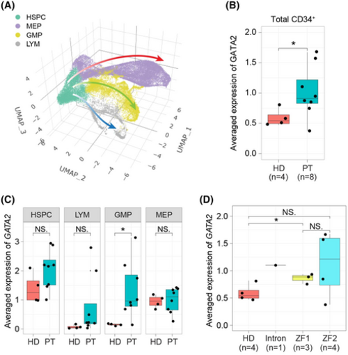
CD34+ cells from germline GATA2 mutation patients show increased mRNA levels of GATA2 compared to healthy donors. (A) Three-dimensional (3D) uniform manifold approximation and projection (UMAP) atlas of single-cell data from public human dataset (GSE135194). Each dot represents a cell and the colour indicates the cell type. (B) Box plot showing the distinct expression level of GATA2 between healthy donors and patients. Each dot indicates one individual sample. t Test was used to calculate p value. (C) Box plot showing the distinct expression level of GATA2 in different cell types between healthy donors and patients. Each dot indicates one individual sample. t Test was used to calculate p value. (D) Box plot showing the distinct expression level of GATA2 between healthy donors and patient samples separated by the various mutation locations. Note that ZF1 mutations are frameshift truncating mutations. Each dot indicates one individual sample. t Test was used to calculate p value. NS, not significant; *p < 0.05. |